12 custom color palettes for PowerPoint slides that work
If you want to make a presentation that stands out then it’s just about choosing the right color scheme.
In a presentation, color is extremely significant. Your slides will look professional and polished if you use a powerful color combination. But that’s not all, your color scheme will also help set the tone of your presentation and draw the audience’s attention to it. Colors even have the ability to affect a viewer’s emotions.
So you want to nail the color scheme for your PowerPoint?
Creating a color palette entails more than just choosing random colors you like. And finding a winning color combination can be difficult if you don’t have any design experience.
If you want ready-made color palettes that work, look no further! We’ve created these 12 great color combo ideas to inspire you. And they come with a few examples to show you how a color palette can be applied to a slide in a variety of different ways (accent vs background colors, light vs dark mode).
- Timeless & reliable
- Serene & warm
- Professional with a fresh touch
- Playful & unexpected
- Outdoorsy & fresh
- Modern & energetic
- Modern & crisp
- Earthy with a vibrant twist
- Cosy & versatile
- Corporate with personality
- Soothing pastels
- Summer vibes
- Always use the theme color palette tool
- Want to find more great color palettes for your presentations?
Timeless & reliable color palette
Blue is one of the most common colors that businesses use for branding, it says “calming and trustworthy”. Blue alone can be too monotonous so in this color scheme yellow is the perfect companion as accent color. The result is very professional and works well in any corporate context.
Color codes: #343752 · #90ACC7 · #FAD12B

Serene & warm color cheme
Neutral colors are very versatile and can be paired with almost anything. A color scheme of all warm neutrals can be sophisticated, calming and comfortable. This is a color scheme that works very well with wedding, cosmetic or fashion topics.
Color codes: #A49393 · #EED6D3 · #E8B4B8

Professional with a fresh touch color combination
If the topic of your presentation is meant to build trust or confidence, to calm your audience or to deliver important — perhaps serious — news, then blue is the color for you. The bright green color balances the palette, creating a fresh feel.
Color codes: #6B90B2 · #1B558E · #CCD64D

Playful & unexpected color theme
For an unexpected color combination that will surprise your audience, try this pairing featuring pink, purple and bright cyan. A youthful and daring palette that can be used to talk about video games, music or new technologies.
Color codes: #F751A0 · #5F3E8B · #2CF4E0

Outdoorsy & fresh color combo
If you need a presentation that emphasizes natural or “green” qualities, a color palette featuring greens is a logical choice. This color scheme brightens things up with a splash of lime green and a touch of warm orange.
Color codes: #89DA59 · #229968 · #F99653

Modern & energetic color palette
The bright red balances out the other two more muted colors and add a bright freshness that gives the combination some kick. This kind of scheme might work well for a presentation that needs to balance a businesslike feel with an energetic vibe.
Color codes: #5EA8A7 · #277884 · #FE4447

Modern & crisp color scheme
Pairing purple and yellow makes for a modern palette that feels professional without being too serious. A modern, attractive scheme that could work for any topic, from corporate to trendy.
Color codes: #544089 · #A5A5CE · #FFBC00

Earthy with a vibrant twist combination
Earth landscapes are full of dramatic contrasts, and so is this color scheme. Here, browns have a rustic realness to them, while golden yellow creates an effect that is powerful without being overwhelming.
Color codes: #E0B90C · #EAE2D6 · #857766

Cosy & versatile color theme
Orange shades are very versatile in their meaning. It is perceived as a friendly and fun color, but also can be very powerful when approaching reddish tones. Use these earthy colors to create a design that is appealing and cosy.
Color codes: #FFA578 · #D45448 · #896E6A

Corporate with personality color combo
To the conservative gray hues, the bright orange shade adds a burst of extra color that is still professional. This combination of gray tones with a bright color is perfect to give seriousness to your presentation without making it too boring.
Color codes: #3B4D54 · #B9BAB5 · #FE8D3F

Soothing pastels color palette
Pastel colors generally come across as pretty and delicate, so you’ll want to make sure your presentation calls for a similar mood if you want to use a color combination like this one.
Color codes: #FDB3AE · #CAE4E2 · #FBDF74

Summer vibes color scheme
This color combination has an outdoor feel to it, like a warm summer afternoon, hanging out at the backyard and just enjoying the day. This combo will surely perk up any presentation you use it in.
Color codes: #03AEB8 · #FFB402· #FC4662


Download these 12 presentation palettes to have them always at hand.
Always use the theme color palette tool
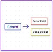
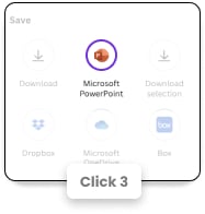
When it’s time to apply your color scheme to a presentation, use the theme color palette in either PowerPoint or Google Slides.
That way, you can adjust the colors easily and quickly, and changes will be applied to the whole of your presentation. Then, if you need to go back and tweak the scheme, you don’t have to edit design elements individually.
Want to find more great color palettes for your presentations?
Here are a couple of great sites to try if you’re interested in finding more original and eye-catching presentation color schemes:
But if you want to understand how color works to create your own custom palettes, check our guide on how to pick the best colors for your presentation. And remember that you can always visit choose from our PowerPoint and Google Slides library for ready-designed decks and color schemes suited to any presentation situation.