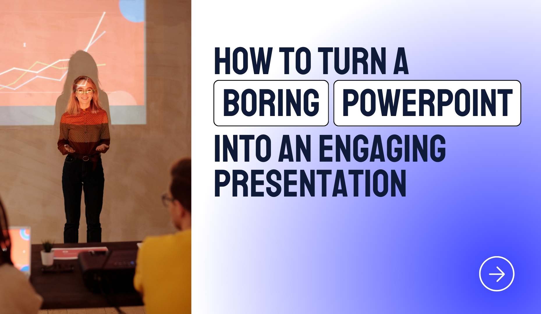
How To Turn A ‘Boring’ PowerPoint Into An Engaging Presentation
Rows of bored faces. Someone checking their phone. Everyone visibly checking out from your Powerpoint presentation and the message you’re trying to convey.
It’s a presenter’s worst nightmare! But what actually makes the difference? What separates an interesting presentation from something deadly dull?
Structure. Content. The presence of the person doing the presenting. These things all have a huge impact on audience engagement.
But sometimes even we have to admit that our topic just isn’t the most inspiring. And there are few of us out there with the TED Talk charisma to really captivate an audience.
Luckily, at times like these, presentation design can come to the rescue.
Even if your topic is dry and/or you’re not uber-confident in your public speaking skills, design has the power to attract and maintain the attention of your audience.
Check out the presentation design ideas below. And don’t worry if you’ve already created your slide deck. These design elements are easy to apply at the last minute of your presentation process – no major re-do required!
- Add a splash of color
- Make your titles stand out
- Use icons to bring your text to life
- Crop images to custom shapes
- Introduce compelling slides with transitions
- Create a story with animations
- Grab your audience’s attention with videos and GIFs
- Vary your slide layout
- Review your white space: is there enough?
- Fade to black to refocus the attention on you
- Feeling stressed out by your presentation design? Apply a ready-made template!
10 easy tweaks to make your presentation much more engaging
#1 Add a splash of color
Color adds visual interest to your presentation. It can be used to convey meaning too:
- Blue is seen as trustworthy
- Green is calming
- Red communicates confidence and excitement
Before you go wild with your presentation color palette, bear in mind that you don’t need to use much color to get the desired effect.
You can add subtle, colorful detail; an icon in the corner of a slide, a square of color next to your title, or a colorful border that graces just one side of your slide.

These small splashes of color are enough to engage a viewer. Extra points if you use color theory to find a color that supports the message of your presentation too!
Whatever template you use, in either PowerPoint or Google Slides, it’s super simple to change up your color scheme with the palette tools. This is a quick and easy presentation alteration that makes a big difference.
#2 Make your titles stand out
The typography you use will have a significant effect on your audience. And, alongside your color palette, will help your audience understand what you’re really saying.
Keep a simple and easy to read font for your body copy, but go a little above and beyond in order to make your headings stand out. Try out unique fonts and big sizes for your titles, thus differentiating yourself from all the other presentations using the same default system fonts.

Serif fonts seem classier and more elegant. Sans serif fonts are known to be more contemporary and informal. But even within these groupings, the shape and texture of your type can make a big difference. Round, soft fonts convey a friendly tone, while more geometric, angular fonts are seen as more outgoing and modern.
There are tons of choices! Don’t know where to start? Try some of the trending typographies on Google Fonts, all are high quality and totally free.
#3 Use icons to bring your text to life
A slide filled with nothing but boring text will have your audience falling asleep in their seats. Add in a few simple but striking icons and you’re much more likely to grab and hold their attention.
Icons break up your text and make it much more digestible. Visual elements like this can also convey a lot about your brand and your message whilst taking up very little space.

So how should you add icons to your presentation?
Incorporate icons in places where you would usually put a bullet point. Pick an icon that represents the information included in the bullet text. Choose colorful icons and you’ll add some much needed color to your slides too.
A great place to find some free, well-designed icons is The Noun Project and here at SlidesCarnival we also have some free and ready-to-use icons for PowerPoint and Google Slides.
As long as your icons are all of a consistent style, size and color scheme, you really can’t go wrong.
#4 Crop images to custom shapes
Your slide design has to be something special if you’re relying on a slide of just text and a square image to engage your audience.
This traditional layout is predictable and it rarely looks impressive. We’ve all seen it time and time again.
Thankfully, using PowerPoint or Google Slides, it’s easy to crop images into a more interesting shape. By doing so you can transform the look of your slides. Even cropping your image into a simple circle looks great and differentiates your presentation from others.

Once you’ve mastered cropping you can take things a step further by using custom shapes to mask your photos.
Try original options like slanted shapes or brush strokes and you’ll create a really unique design that looks totally contemporary and professional.
#5 Introduce compelling slides with transitions
Transitions help you to segue smoothly from one slide to another. A bit of movement catches the eye, they look good and they’re super easy to insert. (They’ve got their own menu heading in both PowerPoint and Google Slides.)

Keep them simple and use sparingly. Flashy options — like draping curtains or paper airplanes — irritate audiences and damage your credibility. Simple transitions, on the other hand, carry momentum and can look really impressive.
#6 Create a story with animations
Surprise and interest your audience by adding a few animations to your PowerPoint slides.
Animations create a story within a slide. They allow you to introduce new slide elements at a time that suits your narrative.
The benefits? You get to control where the focus of your audience is directed. And keep other content hidden until the right moment.
It’s really simple to implement. Just pick a slide where you have both text and a graphic element (a chart, a diagram or an image, for example). Then animate the graphic element to appear after the text.

As with transitions, simple animations — like a fade in — tend to be more effective than complex options. And it’s a good idea to stick with the same animation effect on any given slide.
Whichever animation you choose, use it sparingly. Overuse of animation and sounds make your presentation feel cutesy and unprofessional.
#7 Grab your audience’s attention with videos and GIFs
As human beings, we can’t help it. When we see movement, our eyes are drawn towards it. It’s instinctive.
What’s more, we’re now very used to getting our information from videos and moving images. Information delivered in this way is easy to digest and often very memorable.
So if you want to really capture your audience’s attention, make the most of moving images — like videos and GIFs.

Short videos can be used to create emotion and convey your point quickly. It also gives you a welcome break from talking!
GIFs can be used to add humor or highlight an idea. They can also be used as a slide background. Just be sure the humor and informality GIFs bring to your presentation is appropriate to the setting.
It’s important you use GIF and video in the right context. You certainly don’t want to feature them on every slide of your presentation.
But use them where they fit in nicely and they’ll have a big (and very positive) impact on audience engagement.
#8 Vary your slide layout
Variety is essential to any presentation. Present the same layout with bullet lists on slide after slide and your audience will be bored to the bone.
There are lots of ways you can add in a little variation — even to a presentation that’s nearly finished! Just review your presentation and add in:
- Title slides to divide different sections — these should be colorful and image-heavy
- A little variation to your content slides — include some with just text, some with text and an image, some with a full background image, etc..
- A final slide that encourages participation

These simple tweaks will help to vary and break up your content. In doing so, they’ll keep your presentation eye-catching and engaging throughout.
#9 Review your white space: is there enough?
White space — the (not necessarily white) bits of your slides that don’t feature any text or images — is really important. It’s the golden rule of any graphic design work.
Negative space is good for consistency and readability. What’s more, it prevents your audience from feeling overwhelmed by all of the information they’re getting.
Review and try to increase the proportion of space you include in your slides. The easiest way to do this? Start by using a slightly smaller font size (as long as it’s still readable!) and opting for wider margins.

A good amount of white space will make your presentation look more professional and help prevent your audience from zoning out.
#10 Fade to black to refocus the attention on you
The point of your entire presentation is to deliver a message.
If you’re making a point that requires a lengthy explanation, you want all eyes on you. At times like these, fade your slide into black.
This removes any distractions from the screen and encourages your audience to focus on you and what you’re saying.
It also breaks up the presentation. This can act as a bit of a wake-up call for any audience members who have become disengaged from your presentation and its message.
Feeling stressed out by your presentation design? Apply a ready-made template!
Now you know what to do to improve your presentation design and audience engagement too.
But what if you don’t have the time to implement these tips and tricks? Or you want to be 100% confident that your presentation looks as professional as it possibly can do?
If you’re feeling stressed by your presentation design, the simplest option is to use a pre-made, professional template from SlidesCarnival.
Our templates will save you tons of time and make your presentation attractive, with the visual impact to really engage an audience.
Use our slides as a jumping-off point, taking our template and personalizing it to your brand and message. Or treat your chosen template as a ready-made presentation and just add in your text — this approach requires minimum effort whilst creating maximum effect. Visit our PowerPoint presentation library to discover your ideal template today!


