Now, more than ever, teachers are using PowerPoint or Google Slides to teach their classes. So putting together a winning class presentation has become something of an essential skill!
Unfortunately, elementary school teachers have their work cut out for them. Five to ten year olds are often the toughest audience. If you’re used to working with this age group, you’ll be well aware that elementary kids lose focus fast.
In fact, the average attention span of a 3 to 6 year old is under 15 minutes. And it’s not much better for 7 to 12 year olds. This older age group can only concentrate for around 25 minutes before their attention starts to drift.
At this point — unless you’re able to offer a new activity or a complete change of pace — you can expect lots of wriggling, fidgeting, and chatting.
So, how do you successfully hold the attention of a class and teach them something they’ll remember?
You create presentations that connect and engage with your class from the beginning, right through until the very end!
Good delivery is important. But great presentation design is also crucial to achieving this goal.
- How to make an engaging presentation for kids
- Get very (and we mean very) visual
- Add humor
- Use kid-friendly fonts
- Encourage class participation
- Make slides interactive too
- Ensure the design is age-appropriate
- Use one of these 10 great presentation templates for kids
How to make an engaging presentation for kids
Get very (and we mean very) visual
Young children are concrete thinkers, which means they find it hard to understand something they don’t see in front of them. The younger your audience is, the more visuals you’ll need.
Pictures, props, illustrations, animations, and videos will all help to get your message across. If you’re delivering your presentation in person, you can also use your own body language and movement to your advantage too.

But sometimes a presentation subject just doesn’t lend itself to lots of images, videos, and props. What then?
Well, don’t underestimate the importance of backgrounds, fonts, and color. These design elements can turn a presentation from boring and uninspiring, into something that really catches a kid’s eye and engages them with a topic.
Get the visuals right and you’ll hold kids’ attention and teach them more effectively too!
Add humor
Who doesn’t love a good giggle?
Humor is a sure-fire way to engage kids with their learning. What’s more, it relieves tension — making the learning process easier and much more enjoyable for both teachers and kids!

You can add humor by choosing a funny presentation template design. You could even add a comedy character that appears on all of your slides. Or — particularly for older elementary kids — you could include animated GIFs that get a funny message across in seconds!
Just tread carefully — you don’t want humor to send you off-topic. Always bear your subject in mind and use humor cleverly and sparingly.
Use kid-friendly fonts
Fonts communicate so much more than we think. The wrong font can make a presentation feel formal and stuffy. On the other hand, the right font will help to engage your kids before you even start speaking!
But there’s more to picking a font than opting for the most fun and informal option.

If your kids are still learning to read, it’s a good idea to pick clear and simple fonts. Very decorative fonts might look good, but your children might struggle to recognize the letter shapes!
You should also consider any learning difficulties you have within the class.
Did you know that there are fonts specially designed to help dyslexic students with their reading? Including these in your presentation is a sure-fire way to make your content easily accessible to all.
Encourage class participation
Interactivity prevents your students from drifting off into a daydream. When you ask for their participation, they really have to sit up and take notice.
So, treat your presentation slides as a starting point for interactive learning.

Get kids up off their seats and moving around the classroom. Ask them to repeat key phrases back to you. Get them to stand up and play out some of the ideas in your presentation. You’ll create a truly unique and memorable learning experience in the process!
Make slides interactive too
Often, we think of presentations as a visual aid. But great functionality in both PowerPoint and Google Slides means they can be a really useful interactive tool too!
Whether it’s ‘this or that’ questions, a ‘spot the mistake’ challenge, or ‘guess the word’ games, there are so many ways to make your slides more interactive.

Check out these great interactive presentation ideas for inspiration!
Ensure the design is age-appropriate
Many elements of a presentation will be decided by the age of the children you’re teaching. The language you use. The pace at which you speak. The amount of content you include in your presentation.
And in the same way, presentation design should also be adjusted for each age group.
Cute little animal illustrations may get five years olds squealing with delight. But you’re much more likely to get a bored eye roll from older kids.
To be sure that you’ve picked out an age-appropriate design for your presentation, take a look at some cartoons aimed at the age of the children you’re teaching.
Use one of these 10 great presentation templates for kids
In need of some inspiration? Luckily, SlidesCarnival has a wide variety of free PowerPoint templates and Google Slides themes specifically designed for children.
Here are a few of our favorites. They’re full of color, illustration and fun. And they’re all suitable for a younger audience. Just customize the content and you’re good to go!
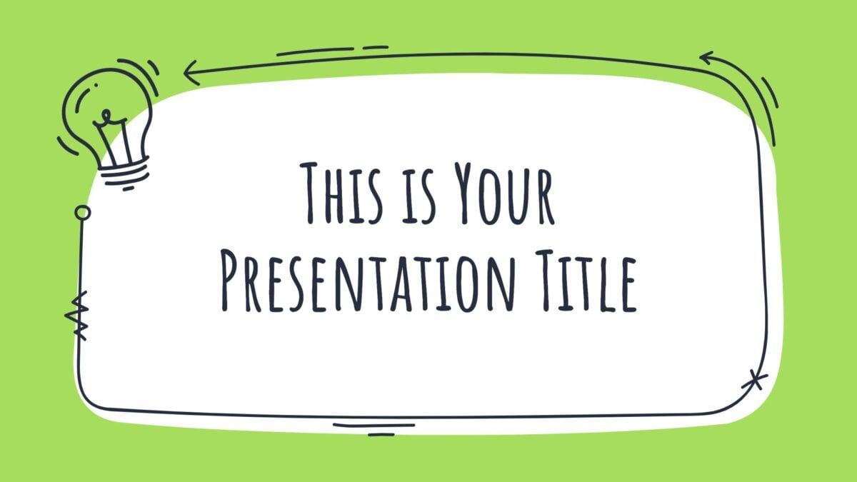
Curio presentation template
This informal presentation template, full of quirky doodles, is a great option for older elementary kids.
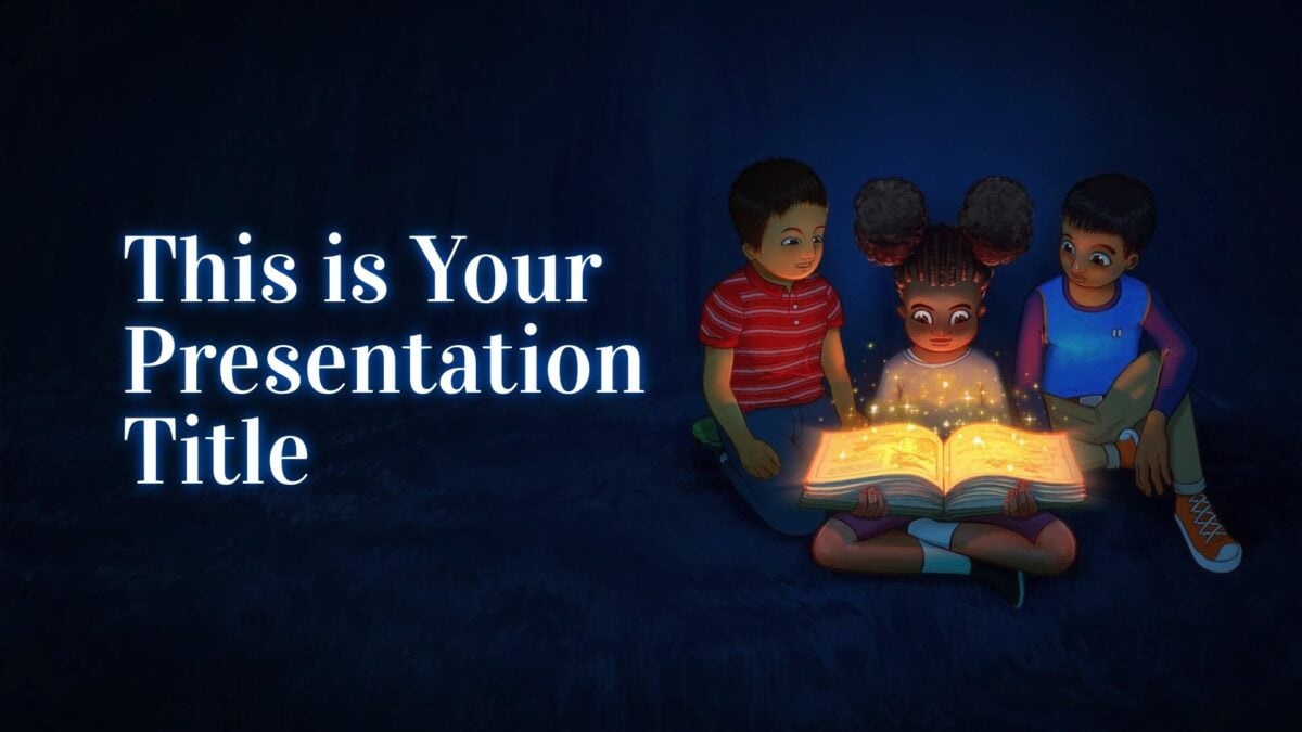
Brabantio presentation template
Want to introduce your class to the wonder of books and reading? This magical template is sure to help.
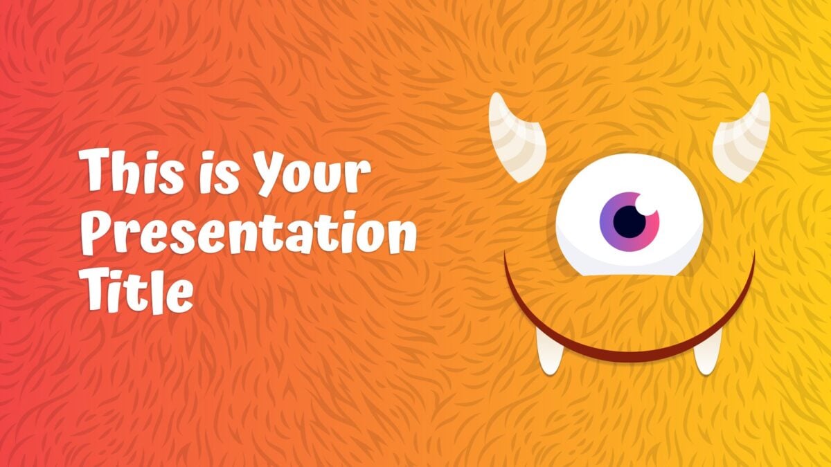
Moth presentation template
Let this bunch of fluffy monsters deliver your presentation! You can even customize your monsters to really delight your class.
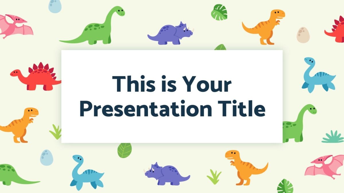
Bagot presentation template
Another great presentation for little ones, this template is filled with wonderful little dinosaur illustrations — and lots of color.
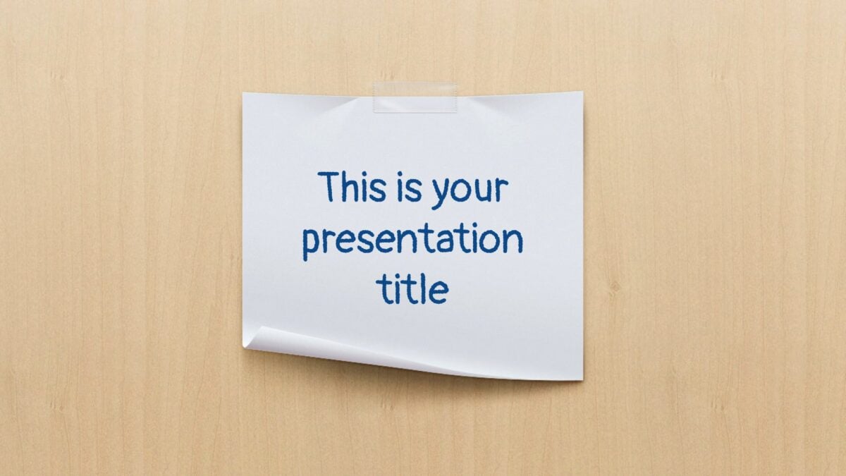
Jaques presentation template
Polaroids, post-its, and scrapbook-style pages. Personalize this presentation to your heart’s content and really catch the attention of your class!

Kent presentation template
Your message is sure to shine through with this clean, simple, and beautifully designed presentation. There’s plenty of color and lots of space for engaging visuals, which makes it a winner with older kids in the elementary age group.
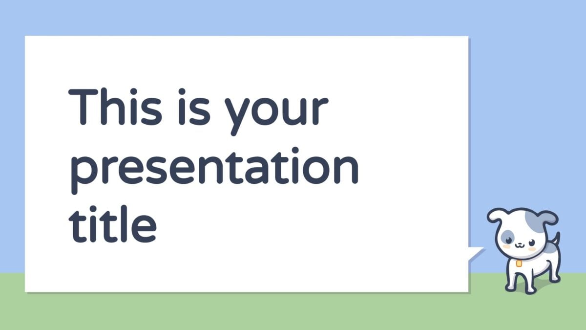
Crab presentation template
This presentation is brought to you by a gang of cute little animals, sure to capture the imaginations (and attention) of younger kids!
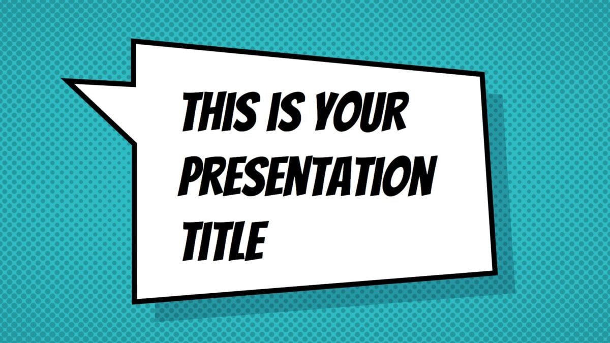
Jachimo presentation template
Deliver your presentation in colorful, comic book style. With speech bubbles, vivid colors, and bold fonts, your kids will be instantly reminded of the Marvel franchise that so many of them know and love.
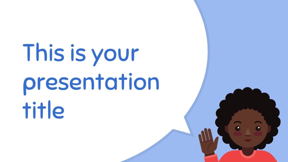
Lucius presentation template
Another simple but really effective theme, this presentation template uses illustrations of children and easy-to-read fonts to get its message across.
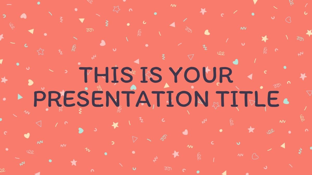
Thersites presentation template
With its colorful confetti patterns, this presentation has a fun and friendly feel. And if pastels feel a little too babyish for your class, it’s super easy to change up the color scheme.
And many more!
Ready for more great class presentation ideas? Visit the SlidesCarnival library to see all of our great presentation templates for kids.

